How I chose the color palette for this site
Choosing a color palette for a web site is hard, at least for me. I've used various color palette tools in the past and they work fine enough but I wanted to use something personal for this blog.
Below is a photo of artwork created by my son Weston. Art is one of his greatest passions and this one has been hanging in our kitchen for a while. I love most of his work but this is one of my favorites. I don't know what the characters mean nor do I care. Something about the color blending and character strokes is just appealing to me.
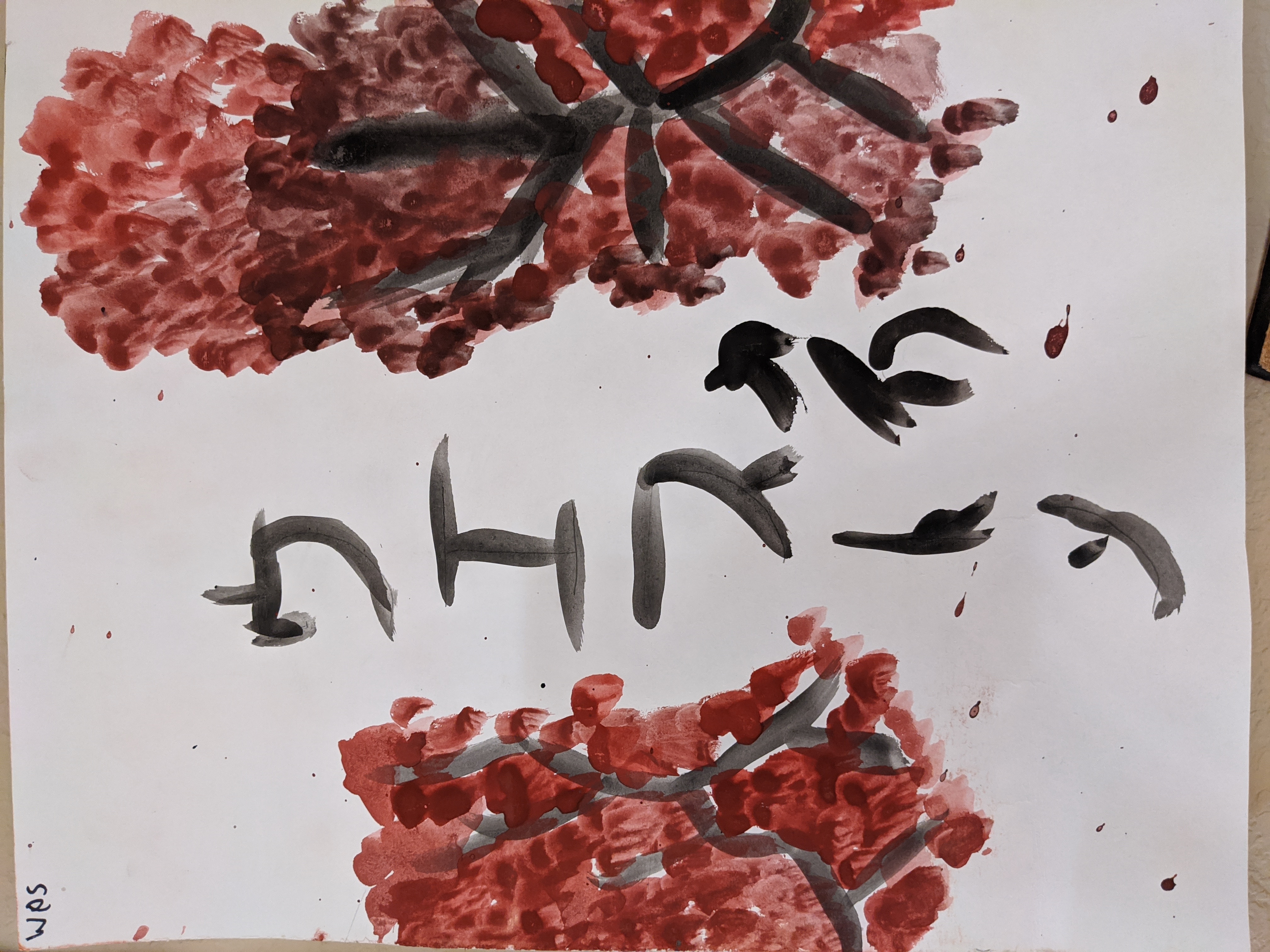
I decided one day that I wanted to incorporate Weston's art into this site but I knew it would be too difficult for me to reproduce that visual into a digital form. Thankfully I discovered coolors.co, which makes it very easy to extract a color palette from an image. Below is the resulting palette where you can see the reds and shades of gray that make up some of the typography on this site.
Join the Newsletter
I write about software development of all kinds (mostly front-end).
I won't send you spam. Unsubscribe at any time.